5.0

on

5.0

on

Intuitive UI Kit and Design System for projects in Figma

✅ Save hundreds of hours on creating components

✅ Save hundreds of hours on creating components

✅ Boost your productivity and earn more

✅ Boost your productivity and earn more

✅ Create easily scalable interfaces

✅ Create easily scalable interfaces

Only $4.99 (+ TAX) for over 1,000 variants and components.

  • Screenshot of the choice cards that are in the UI Kit.
  • Screenshot of the date inputs that are in the UI Kit.
  • Screenshot of the buttons that are in the UI Kit.
    Screenshot of the checkboxes that are in the UI Kit.
    Screenshot of the radio buttons that are in the UI Kit.
    Screenshot of the stat cards that are in the UI Kit.
  • Screenshot of the inputs that are in the UI Kit.

Features

What's included in the Building Blocks UI Kit?
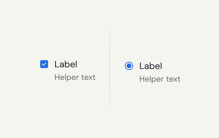
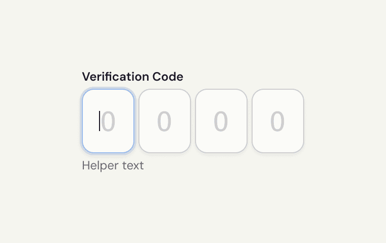
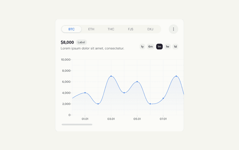
+60 components

Unique components to help you create consistent and useful interfaces.
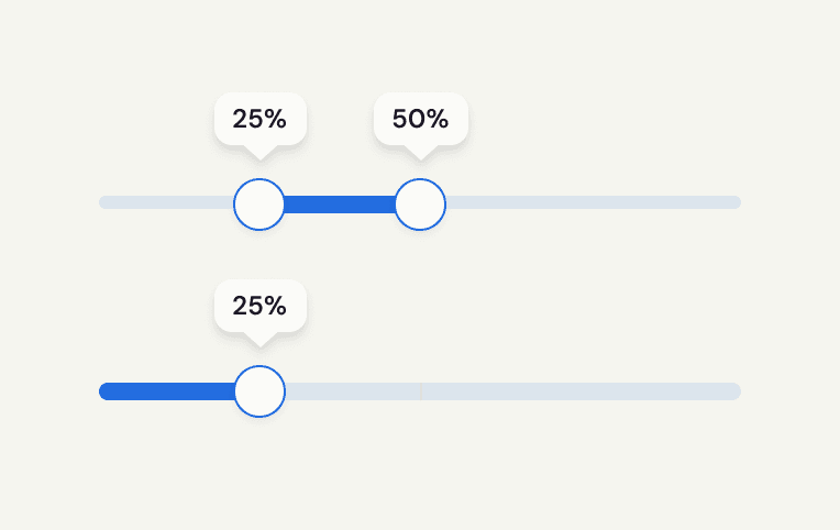
+1,000 variants

Variants of components to ensure flexibility and consistency in your interfaces.

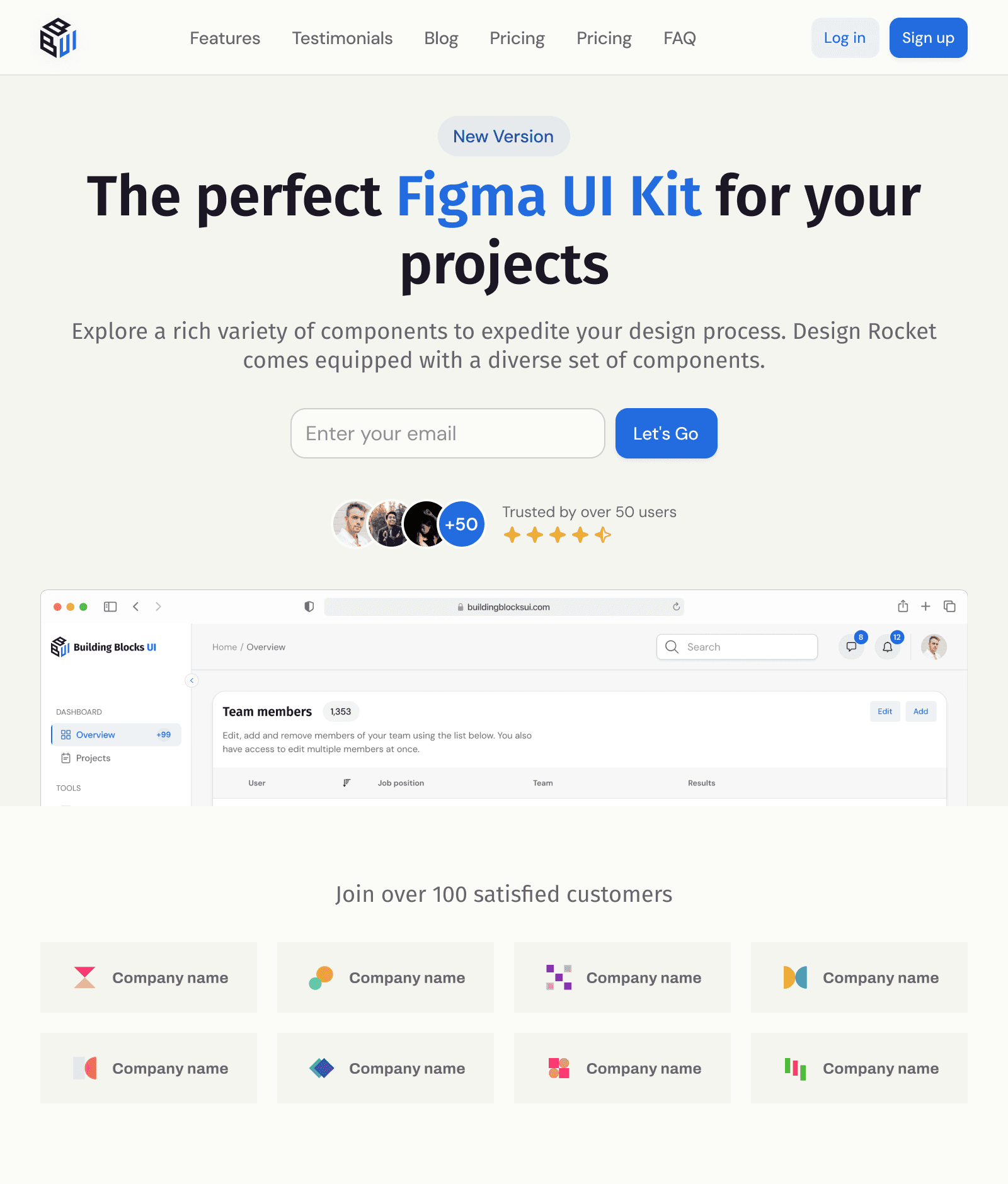
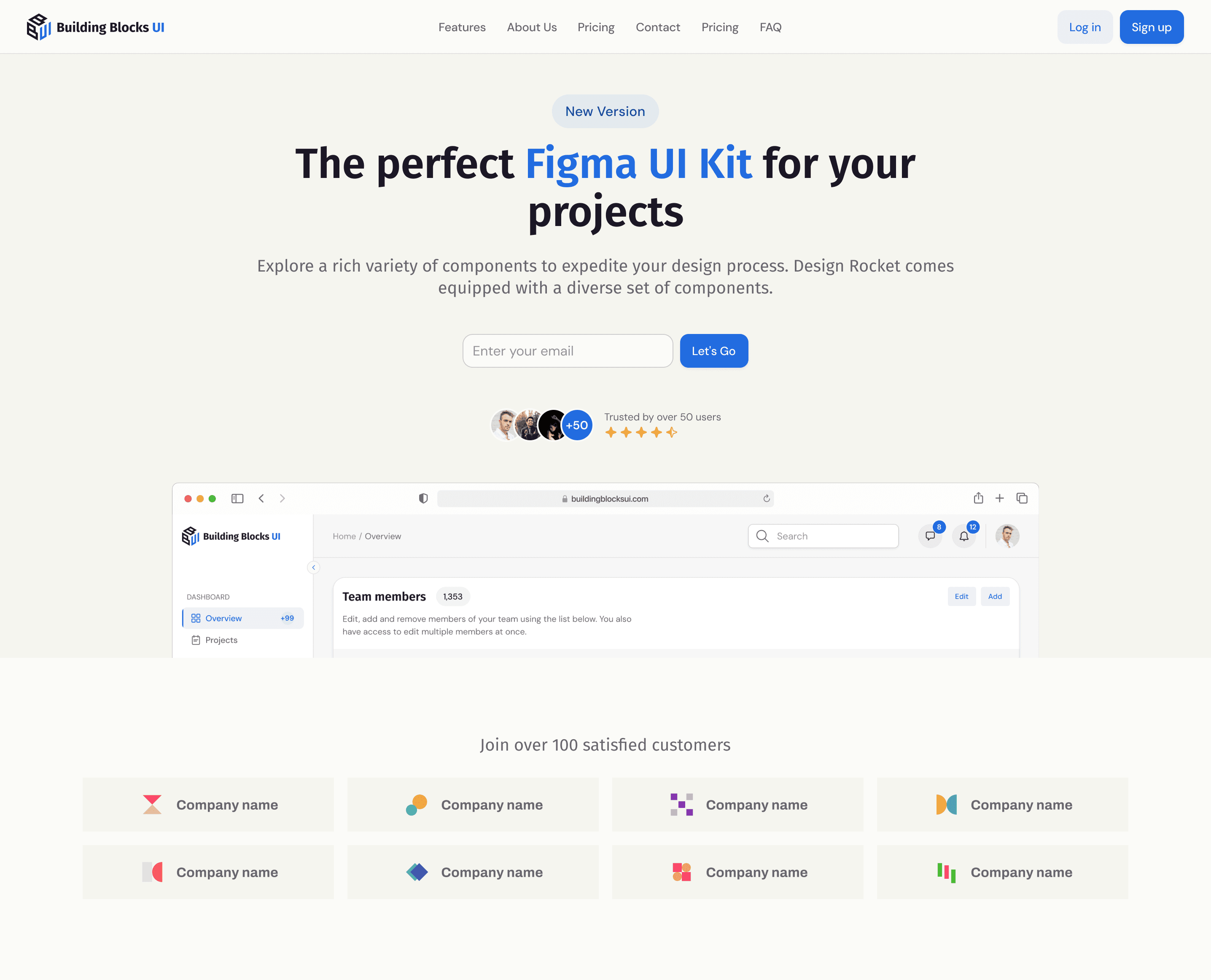
+25 marketing sections

Ready-made templates for marketing sections that will speed up the creation of engaging pages.

+100 color variables

Thoughtful color palette to ensure consistency and legibility of any design.

+60 typographic styles

A set of responsive typographic styles that emphasize hierarchy and aesthetics of content.

20 shadows

Subtle shadows and effects to add depth and modernity to your interfaces.

Solutions

Design System to speed up your work

Design System to speed up your work

Customize your design for branding in one moment

With a semantic color palette, scalable typography and subtle shadows, you can easily customize the UI Kit to fit your unique branding style.

  • Semantic and easy to manage color palette

  • Semantic and easy to manage color palette

  • Adaptive typography to fit any screen

  • Adaptive typography to fit any screen

Mockup showing a checkout screen that demonstrates how to easily change the color scheme in the Building Blocks UI Kit.

Wilson Lubin

Ryan Workman

Wilson Lubin

Ryan Workman

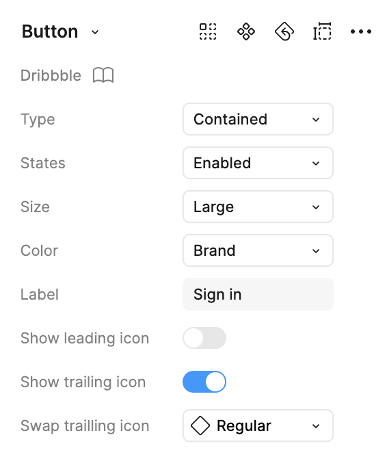
Use pre-made components that work

Each component is created for use in the actual project, with appropriate variants reflecting the states that will be required by developers during deployment.

  • Useful variants for each component

  • Useful variants for each component

  • Components created for easy implementation by developers

  • Components created for easy implementation by developers

Fit the design to the size of any screen

Fully responsive components provide an excellent user experience across all screen sizes, making design on any resolution incredibly easy.

  • All components built on Auto Layout 5.0

  • All components built on Auto Layout 5.0

  • Variants for smaller screens

  • Variants for smaller screens

Wilson Lubin

Wilson Lubin

5.0

on

5.0

on

Buy Building Blocks UI and get access to dozens of components and thousands of variants.

Only $4,99 (+TAX)

For whom?

Who will benefit from Building Blocks UI Kit?

UX/UI Designers

UX/UI Designers

A ready-to-use set of components and styles speeds up the workflow, eliminating the need to design everything from scratch. More time for creativity, less time spent on repetitive tasks.

A ready-to-use set of components and styles speeds up the workflow, eliminating the need to design everything from scratch. More time for creativity, less time spent on repetitive tasks.

Developers

Developers

An easy-to-implement UI Kit designed for developers who want to create polished interfaces without deep design expertise. Well-structured components simplify the process.

An easy-to-implement UI Kit designed for developers who want to create polished interfaces without deep design expertise. Well-structured components simplify the process.

Startups & Entrepreneurs

Startups & Entrepreneurs

A professional UI solution that helps launch an MVP quickly without investing in a custom design. A perfect balance between speed and visual quality.

A professional UI solution that helps launch an MVP quickly without investing in a custom design. A perfect balance between speed and visual quality.

Freelancers

Freelancers

A flexible and customizable design system that adapts to different client needs. Faster project completion with a professional look every time.

A flexible and customizable design system that adapts to different client needs. Faster project completion with a professional look every time.

FAQ

Frequently asked questions

Do you have questions? Find the answers here. Browse the list of most frequently asked questions to find answers to your system design questions.

What is Building Blocks UI Kit, and how does it help in design?

Building Blocks UI Kit is a collection of predefined components and templates that accelerate UI design. It helps maintain visual consistency and saves time during the design process.

Who can use Building Blocks UI Kit?

Is it compatible with Figma?

Can the components be customized?

Will there be future updates?